Japanese graphic design is one of those topics that people assume they understand until they try to describe it. Everyone recognises the look — the clean white space, the off-centre typography, the confident use of red, the calligraphic brush marks next to razor-sharp geometric shapes. But “Japanese design” as a field is actually three overlapping schools arguing with each other: the mid-century poster masters, the 1980s pop-art disruptors, and a current wave that is unapologetically digital.
In This Article
- Quick facts at a glance
- What is “Japanese graphic design”?
- Who are the big names in contemporary Japanese graphic design?
- Kenya Hara (b. 1958)
- Kashiwa Sato (b. 1965)
- Tadanori Yokoo (b. 1936)
- Ikko Tanaka (1930–2002)
- Yusaku Kamekura (1915–1997)
- Naoto Fukasawa (b. 1956)
- Shigeo Fukuda (1932–2009)
- How is contemporary Japanese design actually different from Western design?
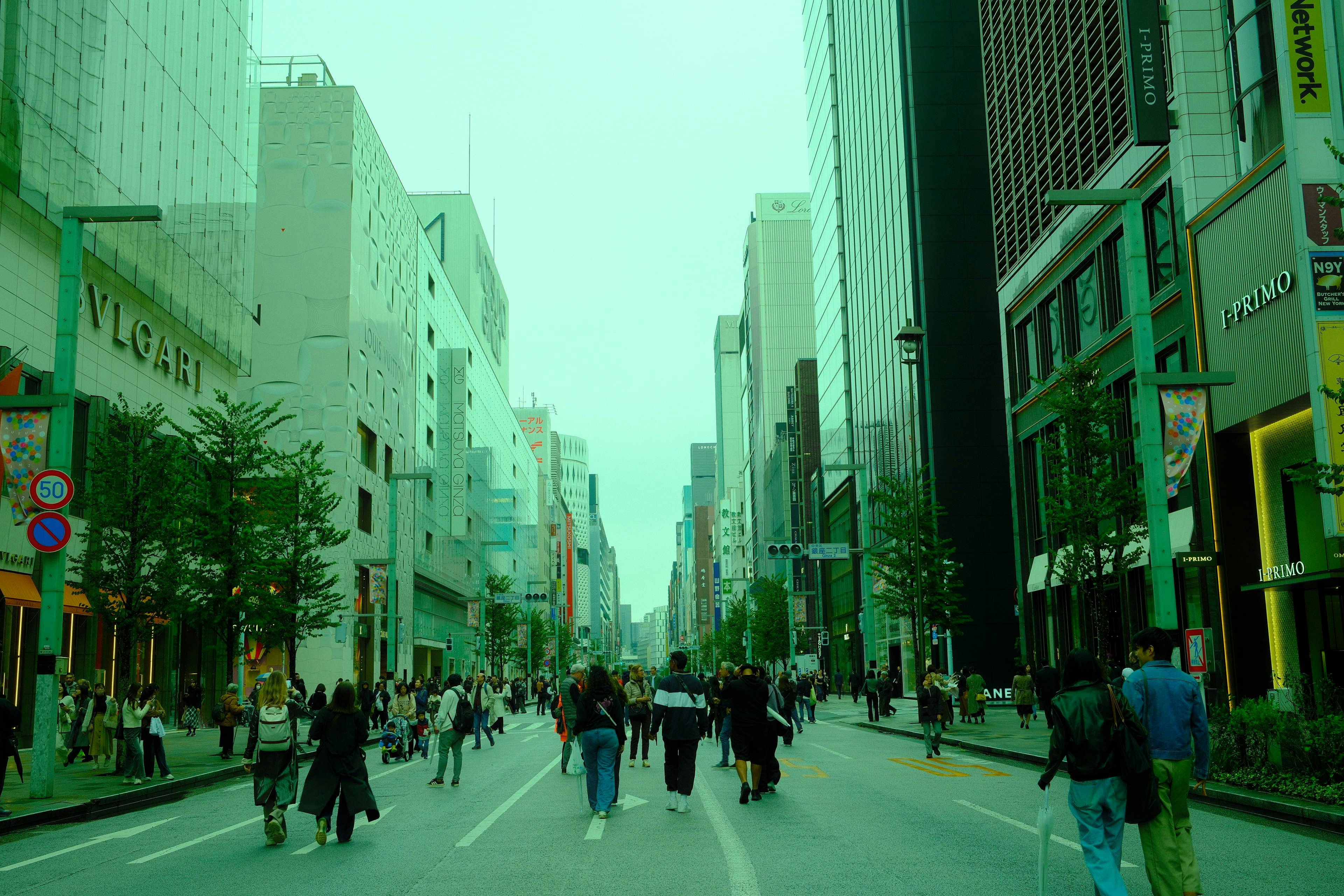
- Where can you see Japanese graphic design in Tokyo?
- Ginza Graphic Gallery (ggg)
- 21_21 Design Sight
- Tokyo Midtown Design Hub
- National Art Center Tokyo
- Good Design Award Gallery
- DNP Museum Lab and the Print Museum
- What makes Japanese typography different?
- What about custom Japanese typefaces?
- How has Japanese design influenced the West?
- What books should you buy?
- Where should you shop for actual design work?
- What about Tokyo design studios you can visit?
- How does this connect to Tokyo’s broader visual culture?
- Is Japanese graphic design in decline?
- A one-day Tokyo graphic design tour
- Should you actually care about this?
This guide walks through what contemporary Japanese graphic design actually is, who the working designers to know are, where you can see the real work in person in Tokyo, and why this small country has had such an outsized influence on global design for seventy years running. The short version: more than you expect, and you can see most of it in an afternoon if you know where to look.
Quick facts at a glance
- Core traits: minimalism, ma (negative space), asymmetric balance, mixed typography, high craft standards
- The big names: Kenya Hara (MUJI), Kashiwa Sato (Uniqlo), Tadanori Yokoo, Ikko Tanaka, Yusaku Kamekura, Naoto Fukasawa, Shigeo Fukuda
- Where to see it in Tokyo: Ginza Graphic Gallery (ggg), 21_21 Design Sight, Tokyo Midtown Design Hub, National Art Center Tokyo, Good Design Award Gallery
- Best book to own: Designing Design by Kenya Hara — the foundational text in English
- Free and worth it: Ginza Graphic Gallery. Always free, always excellent, always rotating.
- Worth a detour? Yes, for anyone who works in design. Probably skip if you’re just passing through and not already interested.
What is “Japanese graphic design”?
Strip out the mystique and there are five things that show up almost universally in Japanese graphic design work, from 1960s Expo posters through to 2026 e-commerce campaigns:
- Minimalism that isn’t empty. Negative space in Japanese design is doing work. The Japanese term ma (間) describes the pause, the gap, the interval — the space between notes in music, the beat between breaths. Applied to a layout, it means the empty quadrants of the page aren’t decoration; they’re functional.
- Balance without symmetry. Western modernist design tends toward grid-based balance. Japanese design often looks asymmetric at first glance but is carefully weighted so each element counterbalances another.
- Mixed typography. A single poster will combine Latin letters, kanji, hiragana, katakana — often at wildly different scales. Designers treat each script as a different texture rather than forcing them into visual conformity.
- Symbolism embedded in shapes. The circle on a white background (Japan’s flag), the irregular brush mark, cherry blossoms, waves, Mount Fuji, the crescent moon — these all show up, but they’re cultural markers, not clip art.
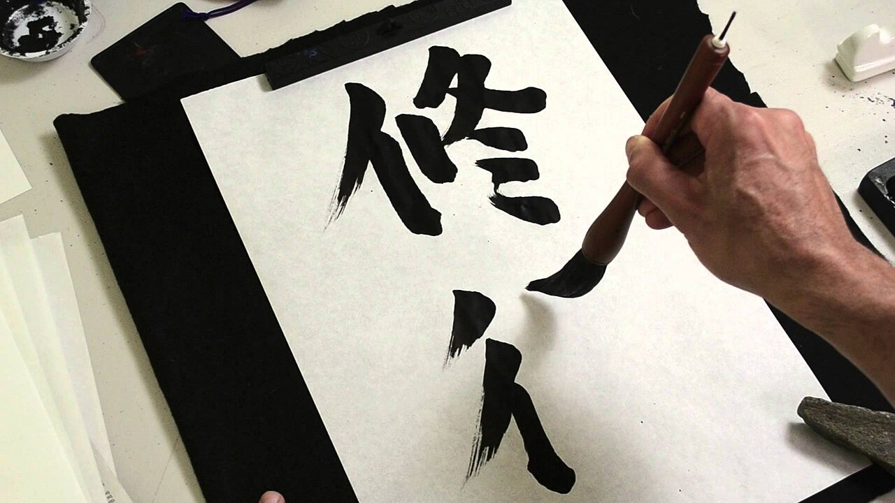
- Craft obsession. The registration on a Japanese poster is tight. The print quality is higher than international average. The paper stock matters. Designers like Kenya Hara will spend a year sourcing a paper and still revise a kerning pair 400 hours into the project.
Sharné McDonald at Linearity traces this back to shodo (書道), Japanese calligraphy — an ancient practice taught to school children that is much more than writing. Shodo is articulation, repetition, endurance, and composition combined. Students learn posture, breathing, and the appreciation of imperfection. When those same students grow up to work in graphic design, they bring those values with them.
Who are the big names in contemporary Japanese graphic design?
A workable shortlist for anyone trying to map the field:
Kenya Hara (b. 1958)
MUJI’s art director since 2002, and arguably the single most influential living Japanese designer. His book Designing Design (Lars Muller, 2007) is the foundational English-language text on the field. Hara’s signature move is what he calls “emptiness” (utsu, 空) — using the absence of content to invite interpretation. Look at any MUJI catalogue from the last twenty years and you’re looking at Hara’s philosophy rendered commercial.
Hara is also director of the Nippon Design Center and a professor at Musashino Art University, making him quite possibly the single most embedded figure in the Japanese design establishment. If a major Japanese brand needs a visual identity reset, Hara is on the shortlist.
Kashiwa Sato (b. 1965)
The person responsible for turning Uniqlo from a suburban Japanese chain into a global identity in the mid-2000s. Sato built the Uniqlo logo and brand system that you now recognise on every flagship from Ginza to SoHo. He also did Rakuten, the National Art Center Tokyo, and the 2020 Tokyo Paralympics identity. His office, Samurai Inc., is one of the most booked design consultancies in Tokyo.
Sato’s method is deliberately systemic — he talks about identity as operating-system design. The same principles that scale across a retail chain, a football club, and a national museum. The 2015 retrospective of his work at the National Art Center Tokyo drew 300,000 visitors, which is an unusual number for a design show.
Tadanori Yokoo (b. 1936)
The wild uncle of Japanese graphic design. Yokoo’s psychedelic 1960s and 1970s posters — densely layered with pop imagery, Japanese cultural symbols, and a Catholic amount of colour — influenced an entire generation of poster designers worldwide. He “retired” from graphic design in 1981 and became a painter, but kept producing prints and posters into his late 80s. Still active.
If you only see one Yokoo poster in your life, make it the 1965 self-portrait where he depicts himself hanging from a noose as a newborn in a sea of pop-culture icons. Yes, really. That image is in every graphic design history survey published in the last 40 years.
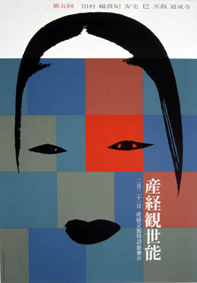
Ikko Tanaka (1930–2002)
The mid-century master. Tanaka built the visual language for the 1981 Tokyo Olympics bid, did MUJI’s earliest identity, and defined what “Japanese modern” looked like in the second half of the 20th century. His 1955 poster for the Sankei Kanze Noh performance is in every design history textbook. If you only learn one name from the 20th century, Tanaka is the one.
Yusaku Kamekura (1915–1997)
The Tokyo 1964 Olympics posters. That’s Kamekura. The single image of a runner bursting across the frame against a red disc defined “Olympic poster” for the next sixty years. Co-founder of the Japan Graphic Designers Association (JAGDA), which still runs the field’s main awards.
Kamekura’s influence is structural, not just visual. The entire awards-and-professional-society infrastructure that supports Japanese graphic designers today exists largely because Kamekura organised it in the 1950s and 1960s.
Naoto Fukasawa (b. 1956)
Primarily a product designer — you know his work from the MUJI CD player that hangs on the wall like a fan — but his graphic and identity work sits in the same lineage as Hara. Together they’re the intellectual core of the MUJI brand. Fukasawa has cited Dieter Rams as his primary international influence, though the minimalism he produces feels unambiguously Japanese.
Shigeo Fukuda (1932–2009)
The playful one. Fukuda was famous for optical illusions and visual puns — his 1975 “Victory 1945” poster (a bullet travelling backwards into its own barrel) is one of the most-reproduced anti-war images ever made. He won the Warsaw International Poster Biennale four times, an achievement matched by no other Japanese designer before or since.
How is contemporary Japanese design actually different from Western design?
The easiest way to see the difference is side by side.
A Western supermarket brochure for the same tomato sauce will generally pick one headline, set it in a sans-serif, anchor it to the top-left corner, and fill the rest of the page with product shots on a 12-column grid. A Japanese equivalent will float three different typefaces at three different sizes, let the tomato itself become a typographic element, and keep an aggressive amount of white space on the bottom third of the page. Neither is better. They come from different assumptions about what a reader is for.
Priscilla Rosales at RGD, writing in 2024, identified five trends as genuinely live in the current Japanese scene:
- Neo-Japanese Minimalism. Pared-back layouts that still carry emotional weight — the classic Hara tradition, updated for digital contexts.
- Cultural fusion. Deliberate collisions of traditional Japanese visual motifs with global/Western design languages.
- Illustrative storytelling. Hand-drawn and painted elements embedded in commercial work — often tied to the ongoing rise of illustrators like Yuko Shimizu who trained in Japan but work globally.
- Digital-first typography. Custom typefaces built for screen contexts with kanji, kana, and Latin characters designed as a system.
- Sustainability visual language. Muted palettes, recycled-paper texture, hand-lettering — the visual signifiers of environmental consciousness becoming a dominant brief.
None of these are unique to Japan. What is unique is the sheer consistency of execution. A Tokyo design studio will hit the brief at a level of finish that you will not reliably get anywhere else.
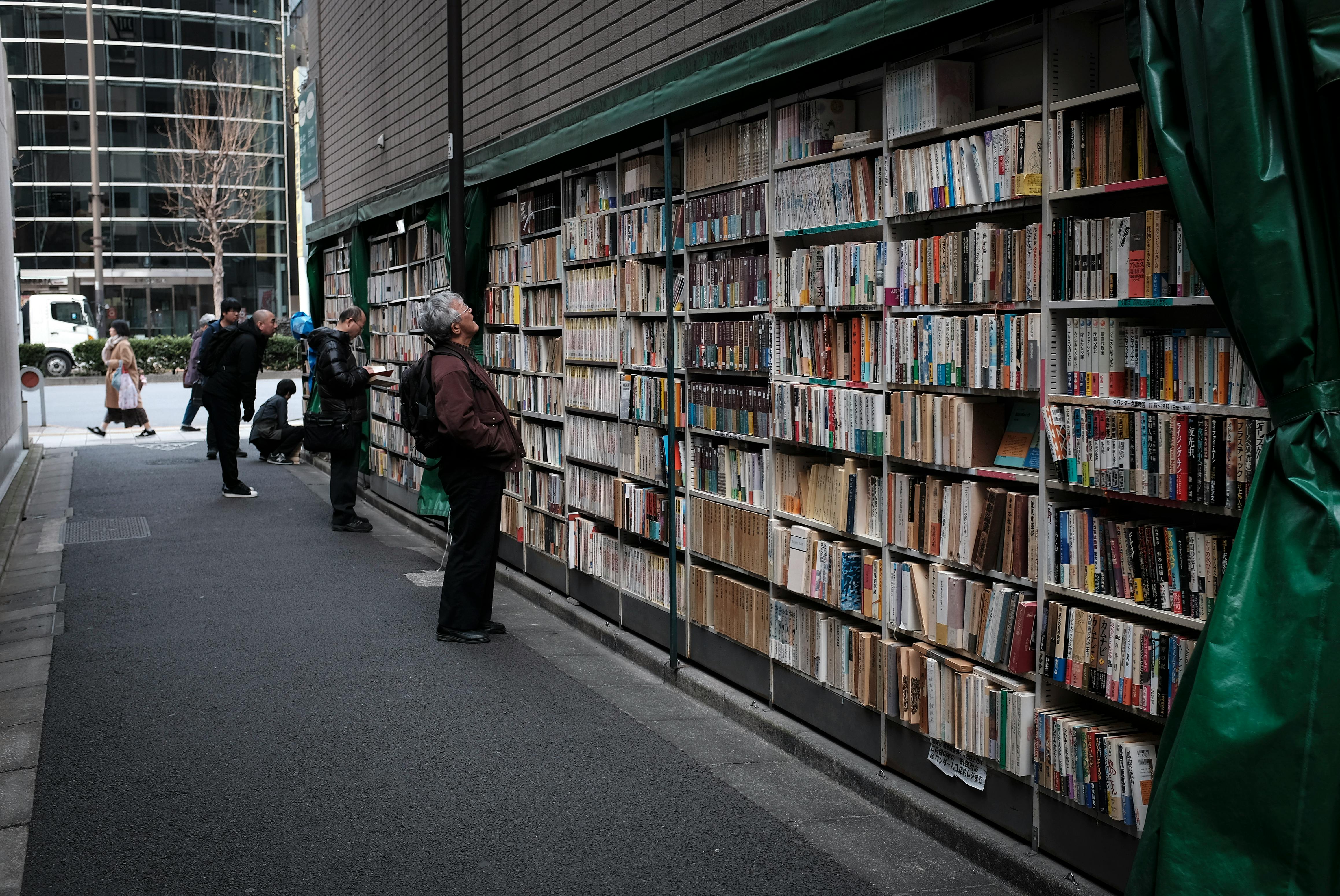
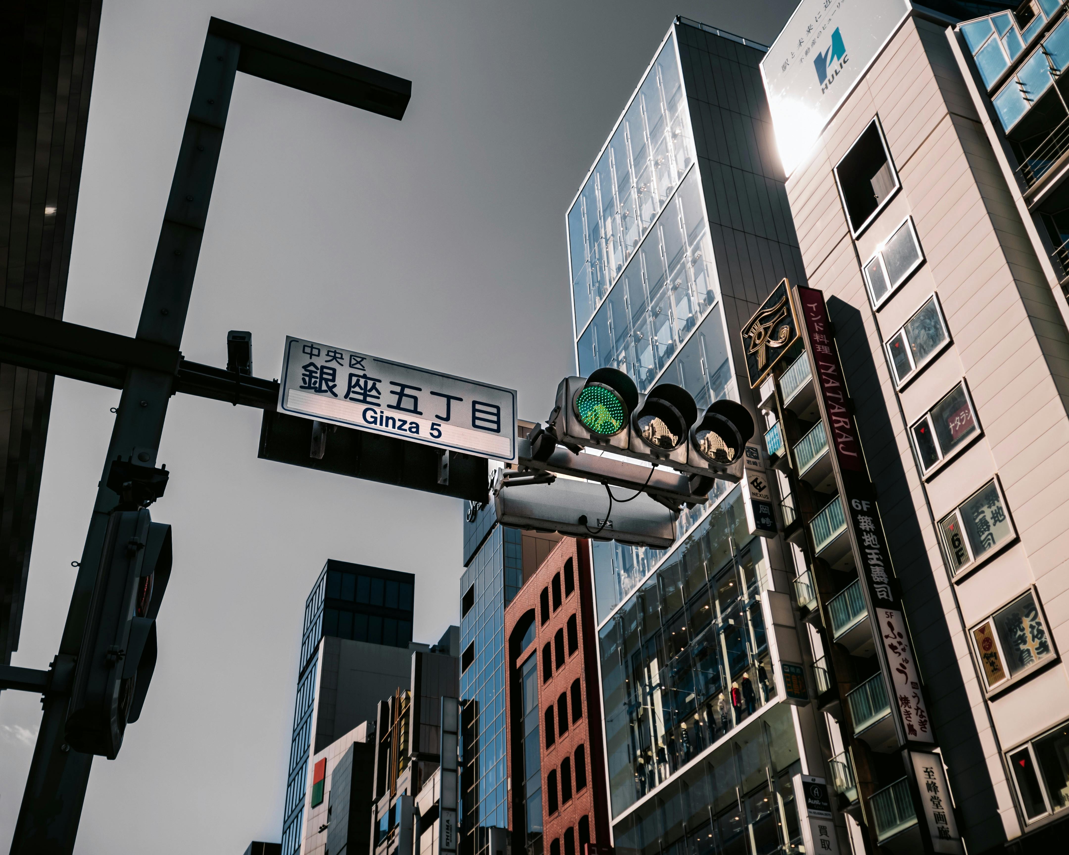
Where can you see Japanese graphic design in Tokyo?
This is where the practical guide kicks in. If you are in Tokyo and want to see actual Japanese graphic design work in person, these are the venues — ordered by how worth-it they are for a first-time visitor.
Ginza Graphic Gallery (ggg)
The single most useful stop for anyone interested in the field. Ginza Graphic Gallery is run by the DNP Foundation for Cultural Promotion and has been the free exhibition space for leading Japanese graphic designers since 1986. The programming rotates monthly: one month a retrospective for a mid-century master, the next a solo show for a working 30-year-old designer. Admission is always free. The gift shop at ggg sells limited-edition posters and catalogues you cannot get anywhere else, and prices are reasonable by gallery-shop standards.
Address: DNP Ginza Building, 7-7-2 Ginza, Chuo-ku
Nearest station: Ginza (Marunouchi, Hibiya, Ginza lines) — 2 min walk
Hours: 11am–7pm, closed Sundays and Mondays. Always confirm on the DNP website before a special trip.
21_21 Design Sight
Founded in 2007 by Issey Miyake, Taku Satoh, and Naoto Fukasawa. Located in Tokyo Midtown in Roppongi, 21_21 runs thematic design exhibitions twice a year, and they are always serious curatorial efforts — recent subjects have included “Hands”, “Sense of Scale”, and “Cooking”. The building itself, designed by Tadao Ando, is a concrete-and-glass piece of architecture worth 45 minutes on its own. Admission ¥1,400.

Address: 9-7-6 Akasaka, Minato-ku (inside Tokyo Midtown)
Nearest station: Roppongi (Oedo, Hibiya lines) — 5 min walk
Hours: 10am–7pm, closed Tuesdays.
Tokyo Midtown Design Hub
Three-minute walk from 21_21 inside the same Tokyo Midtown complex. Design Hub is the joint project of JAGDA, Musashino Art University, and the Japan Industrial Designers Association. They run smaller exhibitions, usually drawing from the JAGDA annual, and host design talks. Admission is typically free.
National Art Center Tokyo
Kashiwa Sato designed the identity; Kisho Kurokawa designed the building. The National Art Center (NACT) in Roppongi is not exclusively a design museum, but it hosts major Japanese design retrospectives on a two-to-three-year cycle, and the building’s glass curtain wall is itself a piece of design. If a Japanese graphic design exhibit is on tour, this is usually where it lands.

Good Design Award Gallery
The Good Design Award is Japan’s primary national design prize, running since 1957. The gallery in Tokyo Midtown shows the annual winners — a cross-section of everything from graphic work to product design to architecture. It is a remarkably efficient way to see what the current design establishment considers excellent. Free admission.
DNP Museum Lab and the Print Museum
For the history-minded: the Print Museum at Tokyo Dome City covers the evolution of printing and graphic reproduction in Japan from the 8th century through the digital era. Niche, but fascinating if you care about how the medium shaped the design.
What makes Japanese typography different?
The short answer: there are three scripts, and designers treat them as three separate design problems that must share one page.
Kanji (漢字) are the logographic characters borrowed from Chinese. They carry the most semantic weight per character and they can be as simple as three strokes (一, meaning one) or as dense as thirty (魔, meaning demon). Designers balance kanji at a larger size than the surrounding text because they are literal pictograms and their visual weight can’t be compressed without losing legibility.
Hiragana (ひらがな) are curved, flowing syllabic characters used for native Japanese words and grammatical elements. They soften any composition.
Katakana (カタカナ) are angular, sharp syllabic characters used for foreign loanwords, technical terms, and emphasis. They read as more modern and urgent.
Mixed into all of this: Latin characters, usually used for brand names or imported terms. Japanese designers frequently treat the Latin alphabet as a decorative texture, giving it a completely different weight and spacing than the surrounding Japanese text.
The net effect is that a single Japanese advertisement often contains more distinct type treatments than an entire season’s Western campaign. This density is deliberate — the reader is expected to navigate multiple typographic registers simultaneously.
What about custom Japanese typefaces?
Custom typeface design is a serious industry in Japan in a way it isn’t in most markets. Major brands will commission their own display typeface for campaigns, and the big type foundries — Morisawa, DynaComware, Fontworks — release new designs regularly. Because each character in a kanji set needs to be drawn individually (there are ~10,000 in common use), a new commercial Japanese typeface is a multi-year project involving teams of designers. Nothing like it exists in Latin-script markets, where a foundry might produce a full family in 4–6 months.
This is why when you see a really well-designed custom type treatment on a Japanese campaign, it feels so unfamiliar — you’re looking at something that literally cost a brand 100× what an equivalent Western custom job would cost. The standards you see are the standards that commercial budget buys.
How has Japanese design influenced the West?
Directly and indirectly, and more than most Western designers realise.
The direct line: Japanese graphic design was introduced to European and American audiences through the AGI (Alliance Graphique Internationale) in the 1960s, Warsaw Poster Biennale wins in the 1970s, and then MUJI’s global rollout in the 2000s. Every art school design programme today includes Ikko Tanaka, Kenya Hara, and Yusaku Kamekura as standard references.
The indirect line is bigger. Apple’s design language under Steve Jobs and Jony Ive was heavily influenced by Japanese minimalism — Ive has cited Naoto Fukasawa specifically. Dieter Rams’ ten principles of good design, which underpin everything from IKEA to Google Material Design, map almost one-to-one onto traditional Japanese craft values. The “clean” Scandinavian design we associate with the 2010s was already a Japanese export by the 1980s.
if you want to understand where Western minimalism came from, skip Scandinavia and go straight to Tokyo.
What books should you buy?
A short reading list for anyone serious:
- Designing Design by Kenya Hara (Lars Muller, 2007). The foundational text in English. Hara walks through his MUJI work, the White exhibition, and his theoretical framework.
- Japanese Graphic Design by Richard S. Thornton (Van Nostrand Reinhold, 1991). The standard academic history, covering 1900–1990. Out of print but easy to find second-hand.
- Japanese Contemporary Posters by Giancarlo Calza (Skira, 2020). High-production-value survey of current designers — the best single-volume overview of the current generation.
- Poster Book: Tadanori Yokoo (Japan Society, 2016). The Yokoo catalogue from his 2016 US retrospective — the best single way to see his body of work at home.
- The JAGDA Yearbook. Published annually. Shows every selected poster from the Japan Graphic Designers Association members. Current-generation practitioners, not history.
All of these are available at the gift shops inside the galleries mentioned above, usually at lower prices than Amazon, and with the bonus that you can flip through them before buying.
Where should you shop for actual design work?
If you want to bring home a piece of contemporary Japanese design:
- Ginza Graphic Gallery gift shop. Limited-edition posters tied to current exhibitions. Prices ¥3,000–¥10,000. Small format, easy to carry.
- MUJI flagship on Ginza. The 2019 Ginza flagship sells Hara-era editions of their stationery, books, and prints that the mall MUJIs don’t stock. Worth a wander.
- ON SUNDAYS (Watari-um Museum shop), Gaienmae. Small independent art-book shop with a killer selection of Japanese design monographs.
- Utrecht, in Daikanyama / Shibuya. One of the best independent book shops in Japan, strong on contemporary design publishing.
- Kinokuniya Shinjuku, 5F design section. Not boutique, but comprehensive. If a book was published in Japan in the last decade, it is probably here.
Pro tip: Japanese galleries and museum shops almost always accept cash over cards. Bring ¥5,000 minimum if you want to walk out with anything.
What about Tokyo design studios you can visit?
Most of the famous studios — Kashiwa Sato’s Samurai Inc., Kenya Hara’s office, Nippon Design Center — are closed to the public. You will not be able to walk into Samurai and browse the portfolio. But a few studios and firms run regular open events and lectures:
- Nippon Design Center (NDC) hosts occasional public talks and their archive exhibitions sometimes appear at the Print Museum.
- D&DEPARTMENT, based in Ryogoku, is a tightly-edited design-and-craft brand with a cafe, store, and rotating exhibitions about long-life design principles.
- AXIS Building in Roppongi houses multiple design studios plus a gallery, a design bookshop, and a small museum-cafe. Walk-in welcome.
For anyone serious about the field, AXIS is the single best location in Tokyo — you can hit a design show, browse the bookshop, grab lunch, and walk out with more understanding in two hours than most conferences deliver in two days.
How does this connect to Tokyo’s broader visual culture?
Graphic design doesn’t exist in isolation here. It sits alongside architecture, product design, fashion, and the fine arts in a continuously reinforcing ecosystem.
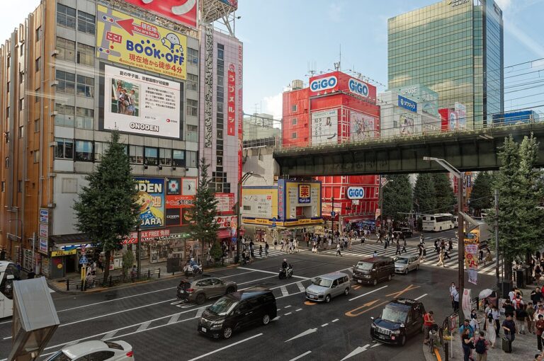
Walk through Tokyo for a day and you will see the same visual principles across all of them: the careful negative space in a Starbucks storefront on Omotesando, the craft in a sushi counter signage, the typography on a public-transit map. The writing system forces designers to be literate in layout decisions that Latin-script countries can treat as optional. That literacy leaks into everything.
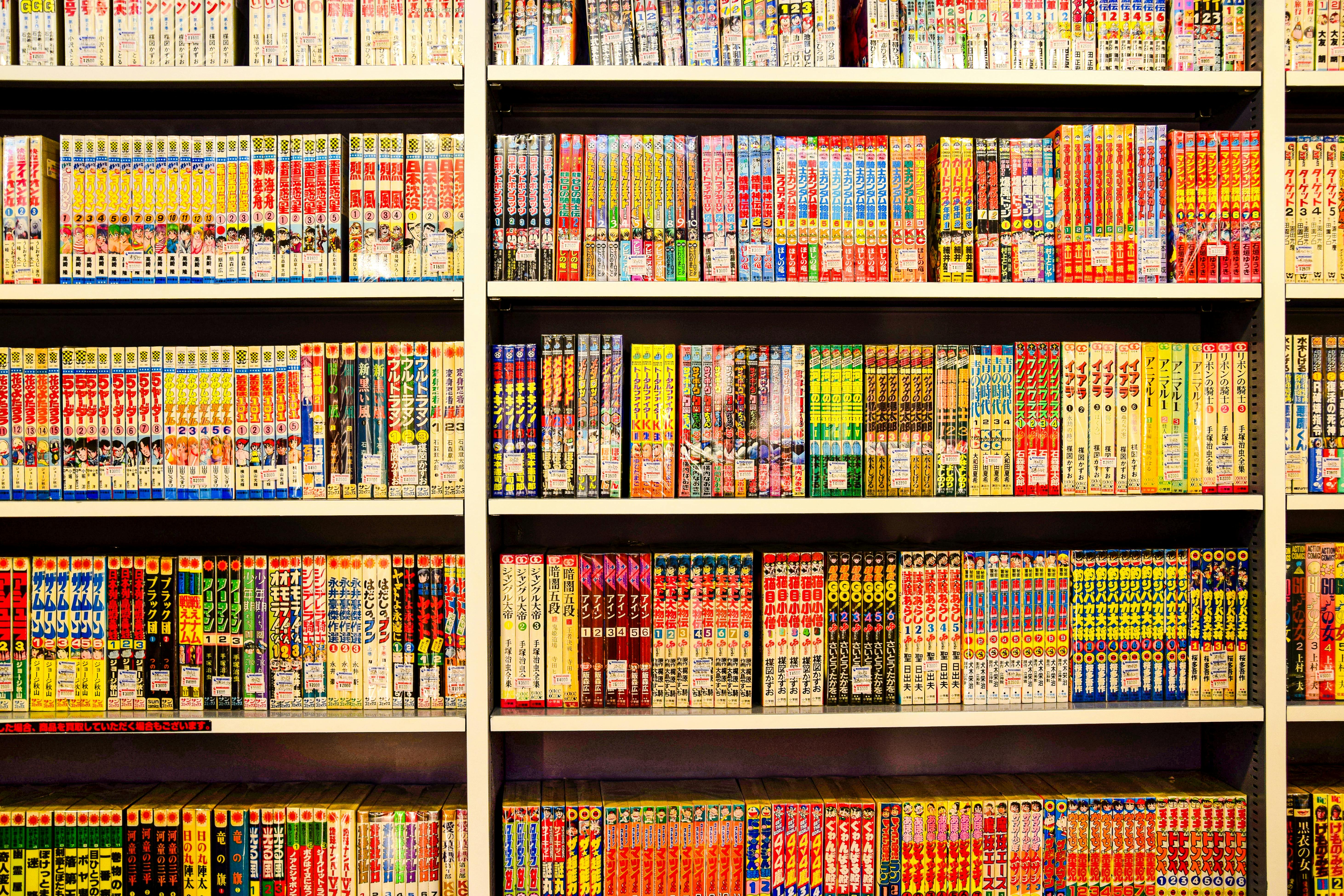
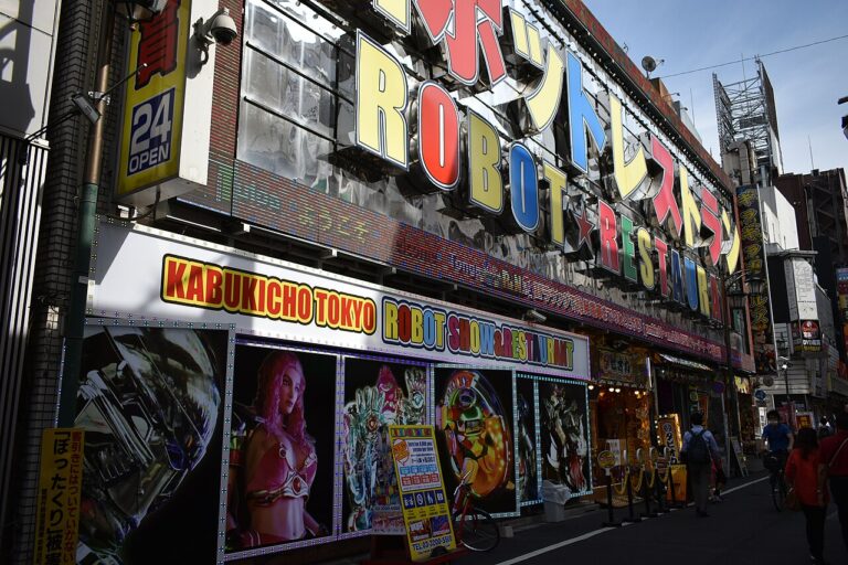
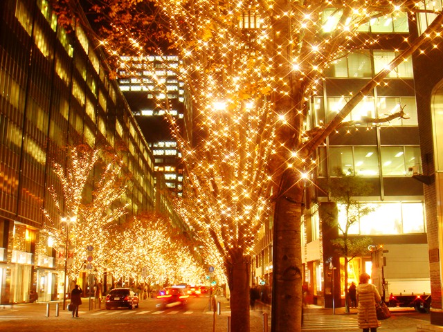
If you are interested in how the writing system itself influences daily Tokyo visual life — shop signs, metro wayfinding, restaurant menus — our article on the history of Japanese visual traditions in irezumi tattooing shows another angle of the same craft-obsessive culture. And the neighbourhood-level culture around contemporary creative work is unpacked in our Akihabara guide, where manga-derived visual languages dominate the street. For an entirely different tradition of Japanese visual intensity — one that sits outside the clean-minimalist canon — look at our piece on the Robot Restaurant and its Samurai successor, where Japanese design logic is applied to pure chaos.
Is Japanese graphic design in decline?
no. But the commercial centre of gravity is shifting.
The old poster-dominated commercial ecosystem that produced Tanaka, Kamekura, and Yokoo is effectively gone. Print budgets for non-essential commercial work have collapsed globally and the Japanese market is no exception. What replaces it is a digital-first design culture where Japanese studios are producing some of the world’s best work in brand identity systems for global tech companies, in typeface design, and in e-commerce UI.
The concerning development is the thinning of the middle tier. The post-war poster golden age depended on a mid-sized cohort of commercial designers earning decent livings from steady print work. That tier is harder to sustain today, and the current generation of Japanese graphic designers is more bimodal: small number of high-end global studios, larger number of freelancers working at lower rates. The top of the field is as strong as ever. The middle is thinner.
A one-day Tokyo graphic design tour
If you have exactly one day and want to see the maximum amount of Japanese graphic design, here’s the itinerary that actually works:
- 09:30 — MUJI Ginza flagship opens. Start here, walk the six floors, read the signage as design.
- 11:00 — Ginza Graphic Gallery. Twenty minutes with the current show, twenty minutes in the gift shop. Pick up a poster.
- 12:00 — Lunch. Any of the Ginza department store basements will feed you well.
- 13:30 — Take the subway to Roppongi. Enter Tokyo Midtown.
- 14:00 — 21_21 Design Sight. Allow 90 minutes including the building exterior.
- 16:00 — Tokyo Midtown Design Hub + Good Design Award Gallery. 45 minutes total, both free.
- 17:00 — Walk to AXIS Building (10 minutes from Midtown). Bookshop, gallery, cafe.
- 19:00 — Dinner somewhere in Roppongi. By this point you have looked at more Japanese design than most art school graduates see in a year.
Total cost: 21_21 entry (¥1,400) plus travel and meals. Everything else is free.
Should you actually care about this?
If you work in any visual or creative field, yes. Japanese graphic design has had a bigger influence on 20th- and 21st-century design than any other single national tradition outside of Bauhaus Germany. The working designers you can see in Tokyo today are producing the reference material that will be taught in design schools twenty years from now.
If you’re just visiting Tokyo for a holiday and don’t work in design, that Ginza Graphic Gallery is a free 30-minute stop that will give you more than a Wikipedia article, but you don’t need to build a design pilgrimage around it. Pop in when you are already in Ginza, look at the current show, flip through a catalogue in the gift shop, and carry on with the rest of your day. That’s the right dose for most people.
For everyone else — designers, art students, illustrators, typographers, anyone who cares about the field — plan a full day for AXIS, 21_21, ggg, and a bookshop run afterwards. There is no richer four-hour design stretch anywhere else in the world.
To see how that design sensibility plays out in immersive space, book teamLab Planets tickets ahead of your visit — it sells out — and the studio’s own teamLab site has the current Tokyo exhibition hours.


.jpg)